A world population map helps visualize how population is distributed across countries and regions. This page provides printable population maps in PDF and image formats for students, teachers, researchers, geography enthusiasts, and anyone studying global demographics.
For reliable population comparisons, it is important to distinguish between historical estimates, current estimates, and population projections. The United Nations World Population Prospects 2024 provides population estimates and projections for 237 countries or areas, while UNFPA provides country-level population indicators for 2025.
- World coronavirus map
- World geographical map
- World Map Wallpaper
- World population map
- Accurate map of World
- Ancient World map
World Population Map
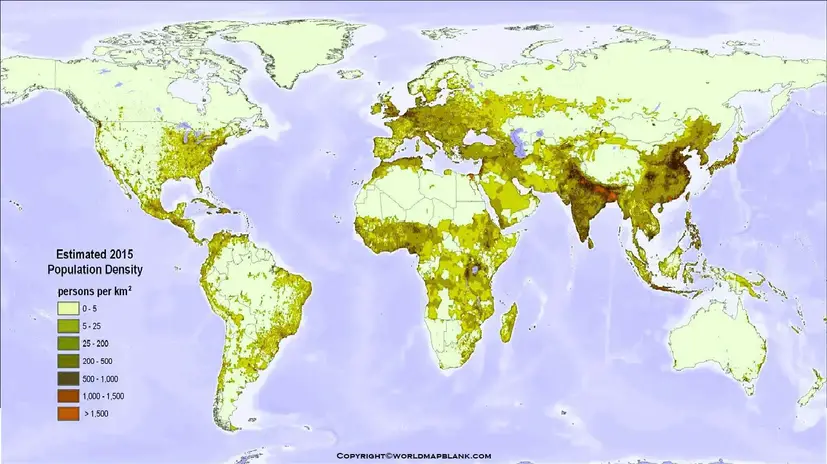
A world population map presents population information geographically, allowing readers to compare countries and regions at a glance. Population maps are particularly useful because a table of numbers can be difficult to interpret geographically.
Population distribution is not uniform. Some countries contain very large populations, while others have relatively small populations. Population size is influenced by factors such as birth rates, death rates, migration, life expectancy, economic conditions, urbanization, and historical demographic trends.
The United Nations’ World Population Prospects 2024 is an important authoritative source for studying these long-term trends. It includes historical population estimates and projections through 2100.
World Population Map by Country
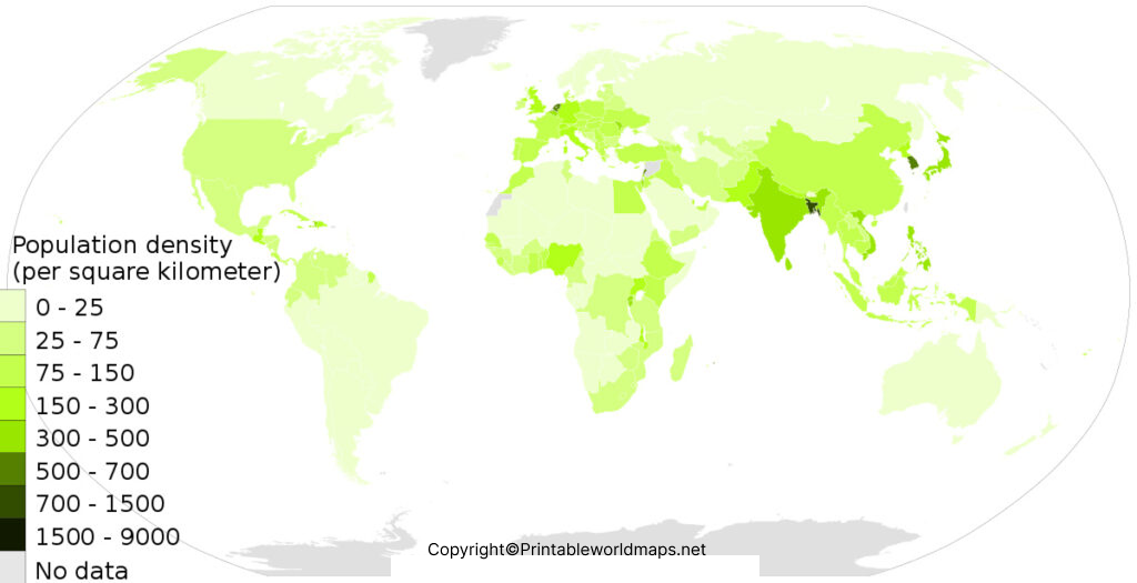
A world population map by country makes it easier to compare the relative population size of countries. It can be used alongside official statistical datasets when a more detailed numerical comparison is required.
According to the United Nations’ 2024 population assessment, the ten most populous countries in 2024 included India, China, the United States, Indonesia, Pakistan, Nigeria, Brazil, Bangladesh, the Russian Federation, and Ethiopia. The UN projects that the ranking will change substantially over the coming decades as population growth rates differ between countries.
10 Important World Population Facts
- India was the world’s most populous country in the UN’s 2024 assessment, with an estimated population of about 1.451 billion.
- China ranked second in 2024, with about 1.419 billion people.
- The United States ranked third, with approximately 345 million people in the UN’s 2024 estimates.
- Indonesia ranked fourth, with about 283 million people.
- Pakistan ranked fifth, with approximately 251 million people.
- Nigeria ranked sixth, with about 233 million people.
- Brazil ranked seventh, with approximately 212 million people.
- Bangladesh ranked eighth, with about 174 million people.
- The Russian Federation ranked ninth, with approximately 145 million people.
- Ethiopia ranked tenth, with approximately 132 million people.
These figures refer specifically to the United Nations 2024 assessment and should not be presented as a live 2026 population count.
Printable World Population Map
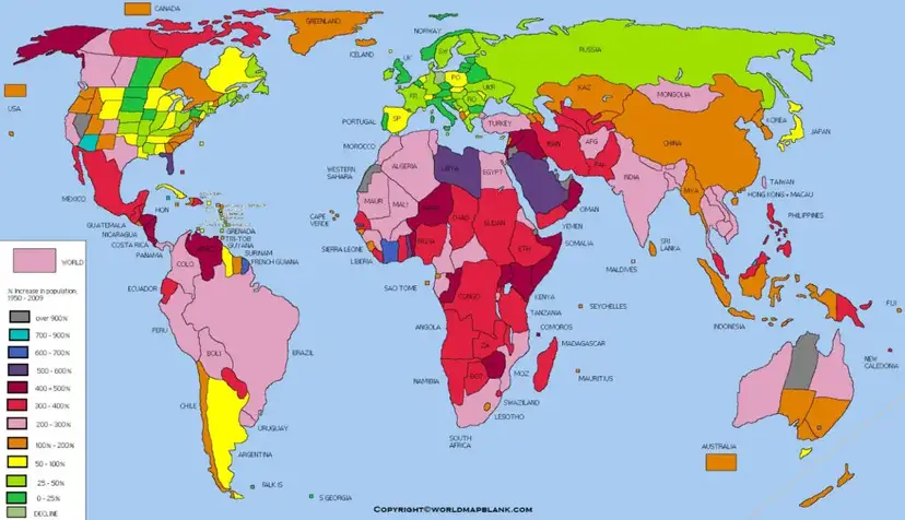
A printable world population map can be useful for classrooms, geography assignments, presentations, research projects, and demographic studies.
You can download and print the map from this page for educational and reference purposes. For research that requires the latest numerical population estimates, use an authoritative statistical dataset such as the United Nations Population Division or World Bank rather than relying only on a static map.
How to Use a Printable Population Map
A printable population map can be used to:
- Compare population sizes between countries.
- Understand broad geographic population patterns.
- Support geography and social studies lessons.
- Prepare school and college presentations.
- Create classroom worksheets.
- Provide visual context for demographic research.
- Compare population patterns with physical or political maps.
- Introduce students to population distribution and demographic change.
World Map with Population
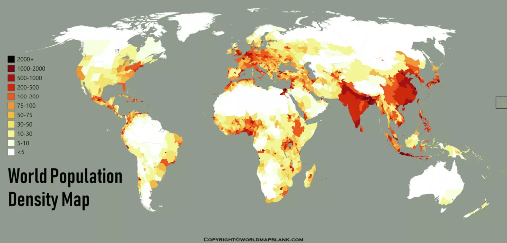
Population maps should be read together with information about the year, geographic definition, and data source. A map based on older population estimates can look different from a map using a newer demographic dataset.
For example, UNFPA reports a global population of approximately 8.232 billion for 2025 and provides additional indicators including age structure, fertility, and life expectancy.
The U.S. Census Bureau also maintains a population clock. Its world population estimate was approximately 8.211 billion on October 8, 2026, illustrating why population figures should always be accompanied by a date and source.
Why World Population Maps Are Useful
Population maps transform demographic statistics into a visual format. Instead of reading hundreds of individual numbers, users can quickly identify broad population patterns across continents and countries.
They are particularly useful for:
Education: Students can use maps to understand population geography and demographic distribution.
Research: Researchers can use maps as a visual reference alongside official datasets.
Presentations: A population map can communicate geographic patterns more quickly than a large statistical table.
Planning and analysis: Population information is relevant to discussions involving infrastructure, healthcare, education, housing, transportation, and public services.
However, population size alone does not describe the complete demographic situation of a country. Age structure, population density, fertility, mortality, migration, and urbanization are also important.
World Population and Demographic Change
Global population growth is changing. According to the United Nations World Population Prospects 2024, the global population is expected to reach a peak of approximately 10.3 billion in the mid-2080s under the report’s medium projection before declining toward the end of the century.
The same UN assessment identifies substantial differences between countries. Some countries are expected to experience rapid population growth, while others are already experiencing population decline or population aging.
This makes a population map more useful when it is viewed as a snapshot of a particular period rather than as a permanent representation of population size.
Population Map for Students and Teachers
A world population map is a useful teaching resource for geography and social science education.
Teachers can use it to create activities such as:
- Identify the most populous countries.
- Compare population patterns across continents.
- Locate countries with rapidly growing populations.
- Discuss population density versus total population.
- Compare population maps from different years.
- Study demographic transition.
- Connect population patterns with urbanization and migration.
Students can also combine the map with official population datasets to investigate how population rankings change over time.
Population Density vs. Total Population
Population size and population density are not the same thing.
Total population refers to the number of people living in a country or territory.
Population density describes the number of people living within a particular unit of land area, commonly people per square kilometer.
A country can have a large total population but relatively low population density if it covers a very large land area. Conversely, a smaller country can have a high population density.
Therefore, a world population map by country should not be interpreted as a population-density map unless its legend and data specifically represent density.
Frequently Asked Questions
What is a world population map?
A world population map is a geographic representation showing population information for countries or regions. It helps users visually compare where people are distributed around the world.
Where can I download a printable world population map?
You can download the PDF population maps provided on this page and print them for educational, research, presentation, or personal reference purposes.
What is the world’s population?
The exact figure depends on the reference date and data source. UNFPA reports approximately 8.232 billion people for 2025, while the U.S. Census Bureau’s estimate for October 8, 2026 was approximately 8.211 billion. Different methodologies and reference dates explain why population figures can differ.
Which country has the largest population?
India was the most populous country in the United Nations’ 2024 population assessment, with an estimated population of approximately 1.451 billion.
Is a population map the same as a population-density map?
No. A population map may show total population by country, while a population-density map measures the number of people relative to land area.
Are population map figures always current?
No. A static map represents the data used when it was produced. Population estimates change, so users should check the map’s date and compare it with current data from authoritative sources.
Can I use the population map for school projects?
Yes. Printable population maps can be useful for geography assignments, classroom activities, presentations, and educational projects. Always cite the map and its underlying data source where required.
What is the difference between population estimates and projections?
An estimate describes population size for a particular reference period, while a projection describes a possible future population based on assumptions about demographic factors such as fertility, mortality, and migration.
Why does population change from one source to another?
Population organizations can use different reference dates, methodologies, revisions, geographic definitions, and demographic assumptions. Comparing figures is most meaningful when the year, definition, and source are consistent.
Reference Links
https://www.un.org/development/desa/pd/world-population-prospects-2024
https://www.unfpa.org/data/world-population-dashboard
https://data.worldbank.org/indicator/SP.POP.TOTL